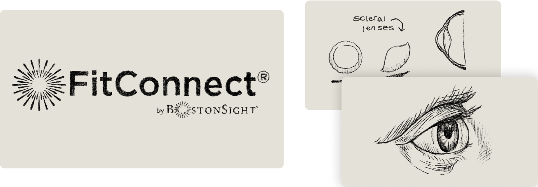
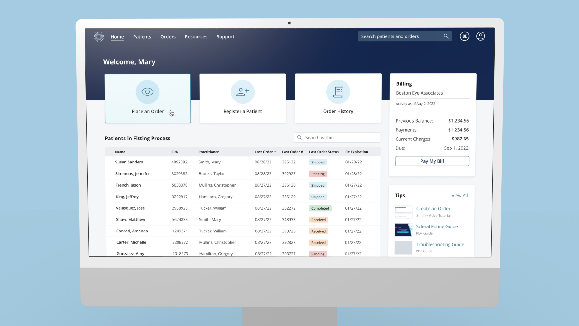
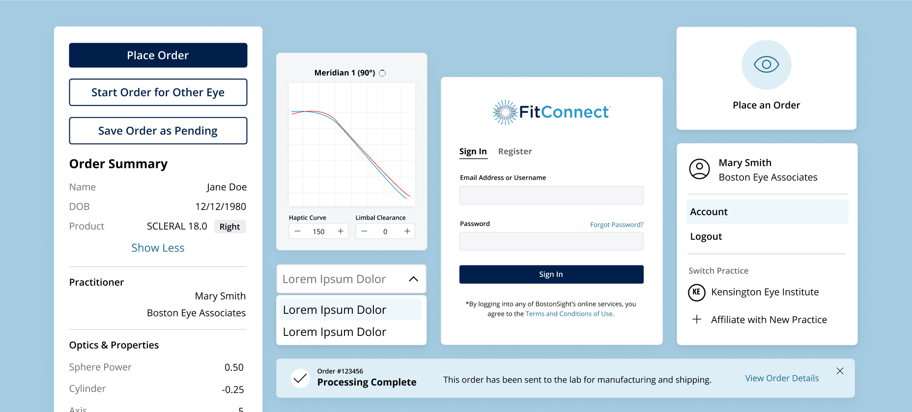
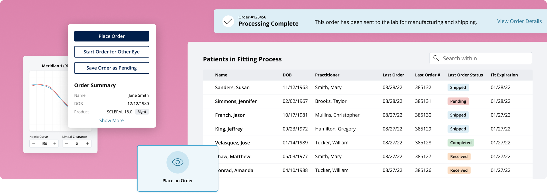
Making contact-lens ordering more visionary
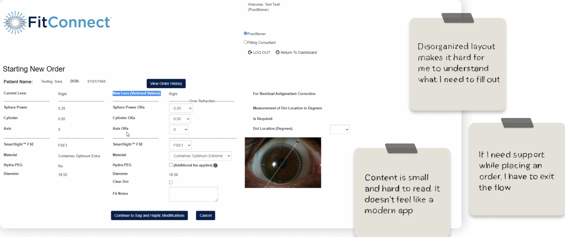
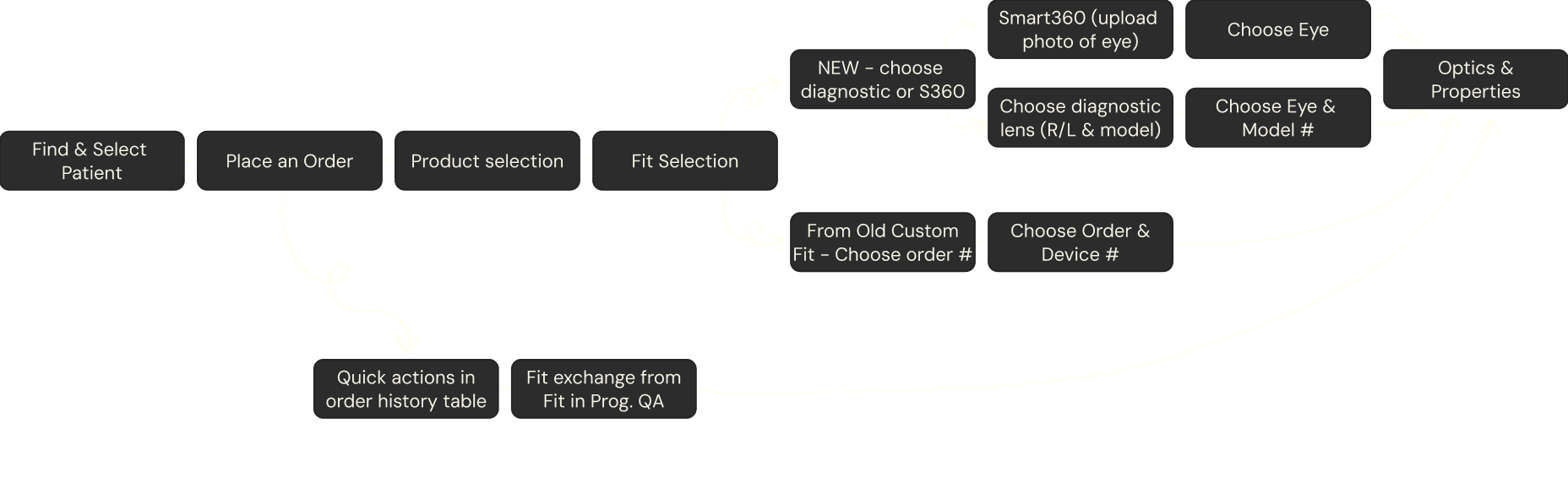
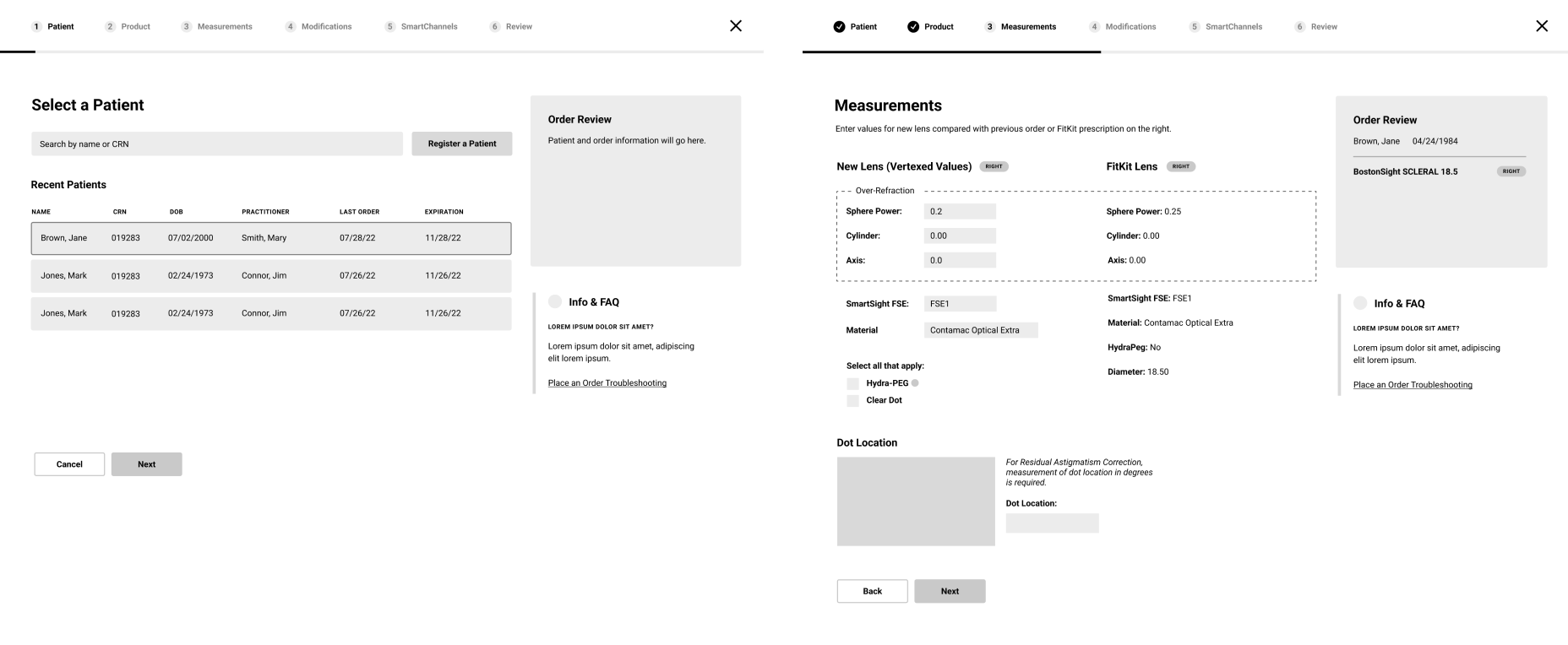
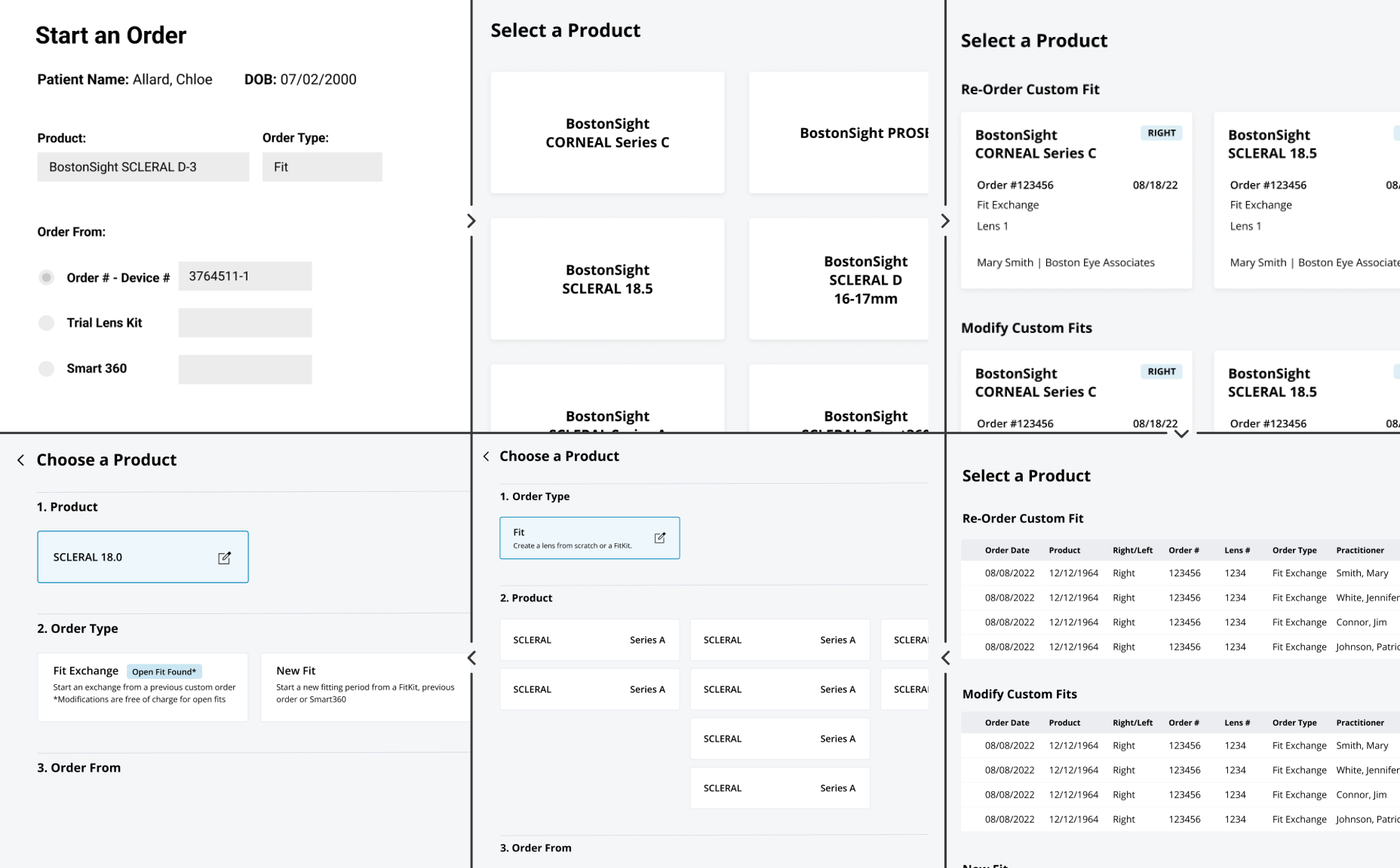
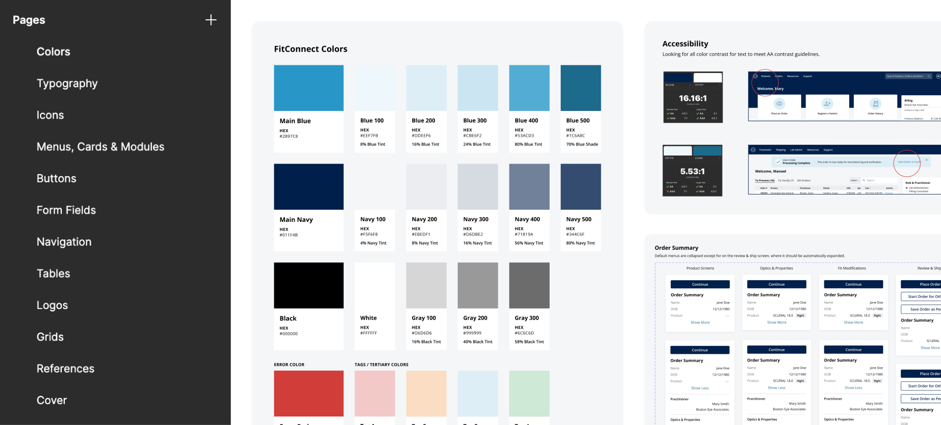
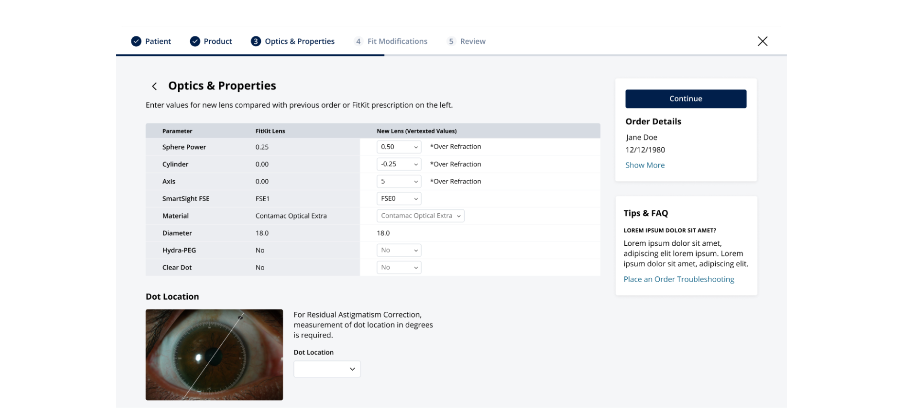
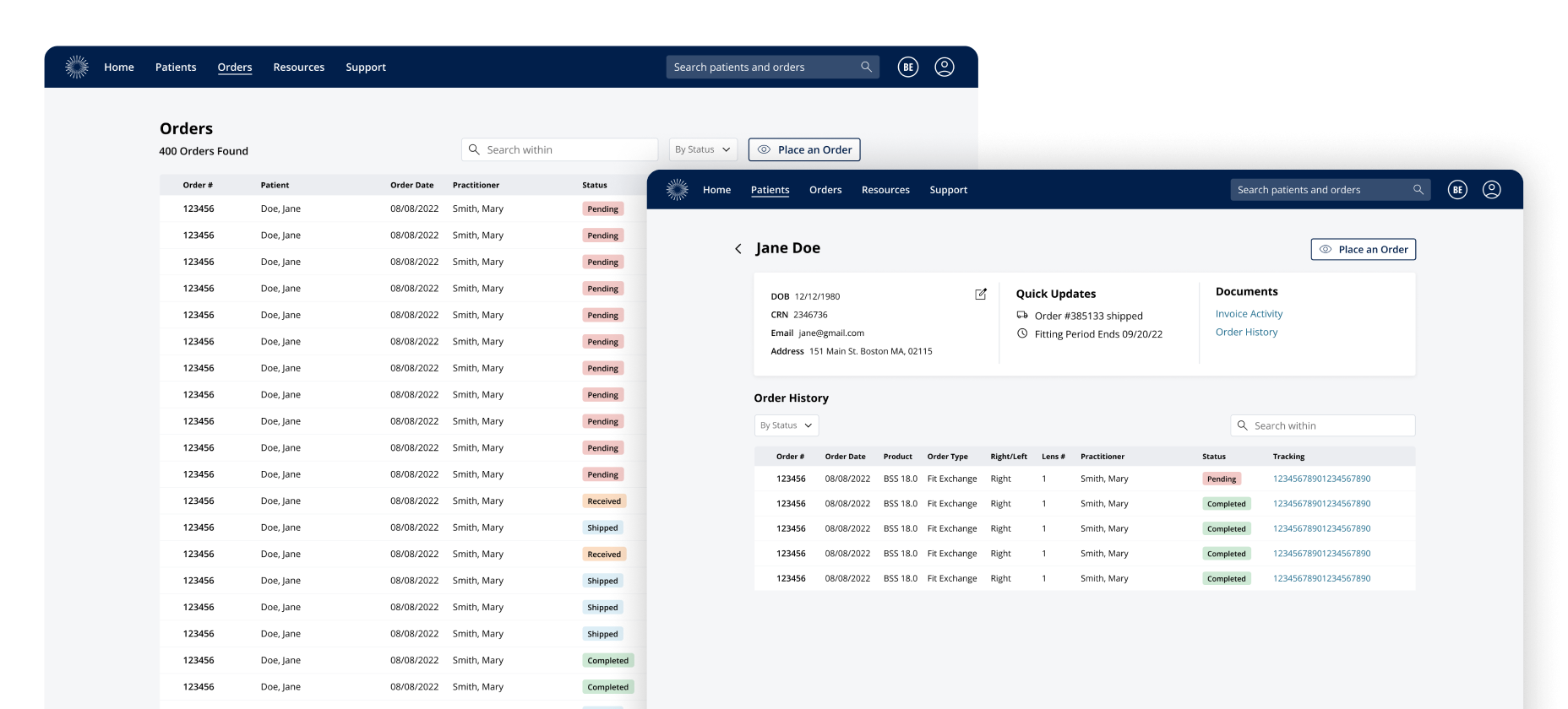
Designing custom scleral lenses is no easy feat for eye doctors. Using ecommerce style patterns, we streamlined the process and diminished their need for software training.
BostonSight is a scleral lens manufacturing company that many eye doctors go to for patients with visual abnormalities. The custom nature of scleral lenses lends itself to a more comfortable fit, however it results in a more complex process to configure the correct size, shape, and material. To make the process easier for practitioners, BostonSight set out to create FitConnect—an app for designing lenses, placing orders, and keeping track of patients.
When it came to placing a new order for a patient, practitioners relied heavily on the application’s training videos and instruction—which took precious extra time in a doctor’s already crazy schedule. They needed it to be quicker and easier.
To solve this problem, I started by looking to other online flows that allowed users to “build” a fairly complicated custom product—like building your custom car, or designing your very own custom Converse. This concept, while a bit more complex than a simple “add to cart” style flow, is fairly commonly used and vetted across hundreds of companies and their users—so we decided to try it out for a new patient order flow.
This concept immediately resonated with stakeholders, supervisors, and researchers so I got to work converting them to a higher fidelity. The iterative process did glean a few new details and revisions to solve for as we went. For example, one aspect that stakeholders called out was the way in which doctors choose the correct product. Our initial solution was to keep products simply laid out in cards—but it turned out that there were many dependencies across fit and type that would require a specific order of selection.
With the design of the dashboard and ordering flow largely finished, it was easy to start building a design system of components and styles. This would not only help us finish designing additional pages in a consistent way, but it served as a cohesive set of guidelines for the design and development of FitConnect as a whole.
Using these guidelines we were able to iterate on designs for key pages like the main dashboard, the patient account page, order history, login, and billing.
After many rounds of feedback, we landed on a more modern dashboard and wizard-like ordering experience, with much cleaner pages for orders and patients.
Working with a UX researcher, 5 practitioners were interviewed and tested out the figma-built prototype of FitConnect. Overall the participants were much happier with the simpler dashboard, flow and navigation.
Practitioners called out a few areas that could be improved upon to make their experience more convenient as well as enhance clarity for new fitconnect users.
The reimagined FitConnect makes placing and tracking orders much more intuitive.
In the end, not only did we optimize the ordering flow efficiency & timing, but we also modernized the design of the dashboard for improved order tracking. User satisfaction also increased, from testing with practitioners. My key design takeaway? Complicated procedures don’t require complicated UI—in fact it’s the opposite approach which made this redesign so successful.
Thanks for reading!
Using code as a means for experimenting with different pixel patterns, we can create unlimited knit & crochet designs.